Biting the Bullet: ending Death by PowerPoint (II): images to convey meaning, retention and attention
USE OF IMAGES
The heart of my challenge to Death by PowerPoint (DBP) is images. Many others use pictures; most frequently it is an image that accompanies text and is descriptive. It normally is a subset to the slide and the text. My use of images inverts this. I use images as the illustrator and conveyor of complex social relationships, and as the means of generating and retaining attention and engagement. My images fill the entire slide and are accompanied by text in moderation. The Golden Rule is no more than 7 words for any one slide.
Writers in academia (Mayer et al) argue that our brains can process images and words simultaneously, and that this helps our learning and recall. Taking it out of academic research and into the ‘real world’, we find that the top end of the business world, they;re a long way ahead of us. They, and academics, are engaged in similar pursuits: to convey social ideas in visual form. Believing in Mayer’s findings, and seeing how much better good images are than a PPT slide filled with text, I adopted business methods. I read key texts like Presentation Zen and adopted key elements, like ‘less is more’, white space, simplicity and clarity.
So to briefly recap, I use images for 3 reasons
- To engage attention
- To retain attention
- To translate the literal to the figurative (images to communicate social meaning)
The images are very large, by which I man that they cover the whole of the slide, and are also high resolution. File sizes can get a lot bigger. I have been told that I don’t need to use such large images, but I have not found that smaller size images are as clear as larger files. I think it’s important to have crystal clear, high quality, high resolution images. I think anything else looks less professional.
When I have defined in my mind the concept I want to communicate, I look for it using Google’s Advanced Image Search facility. Finding the right slide can be hard and is sometimes down to luck as much as deliberation, but it has become easier and faster the more I do it. However, sometimes I can’t find the right image, and I make my own. I am still an amateur at this, but the School of Arts has been helping me get the basics of Photoshop. My first effort is here; it’s a bit corny, perhaps, but I am using to chart the evolution of my practice
I wanted to convey the idea that UN peacebuilding was in trouble. It was in the light of a variety of disasters, from Haiti and Somalia to allegations of corruption, sex trafficking and so on. There were hundreds of lovely, compelling images of UN vehicles against a nice sky, or wrecked helicopters, but they didn’t connect for me. Instead, I got a grunge version of the UN flag and made that the slide background in PPT, and then cut some bullet holes from a free image using Photoshop, and pasted them onto the PPT slide.
I wanted to convey the sense that critics were contending that peacebuilding wasn’t building peace and that the UN approach was ontologically flawed, perhaps ruinously for some countries. I wanted the image to tell the students about an issue with the UN. In my view, it’s basic. But I made do and I think it works well enough. This was an early attempt. Looking back, it feels fairly primitive, but it set me on a path I have pursued to the point that I am learning to use Photoshop for the creation of my own digital art. I found a hobby in the process.
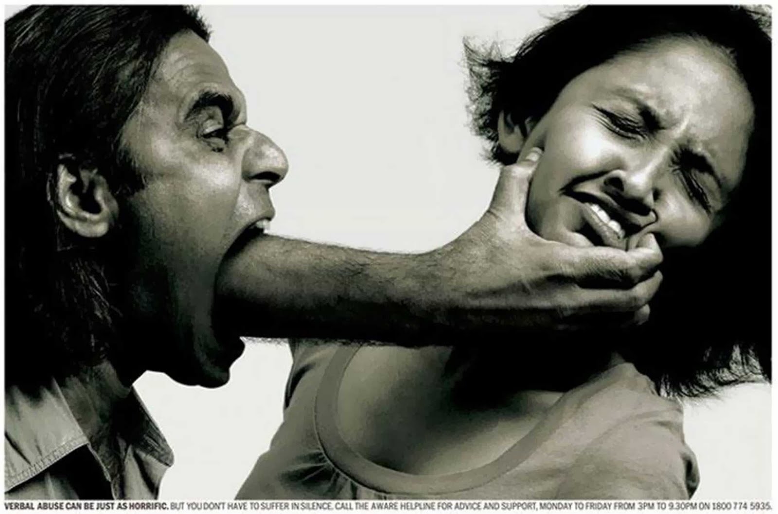
As I prepared for one particular lecture, on domestic violence, I wanted to see if I could find or create an image that would convey the idea that violence isn’t usually, or even mostly, physical. I used this image in the first blog, but want to use it again because of its value in explaining what I am talking about, and what I am feeling.
The literature on Domestic Violence, or Intimate Partner Violence as it is sometimes called, suggests that controlling men often use words and threats to manipulate, constrain, dominate and oppress their partners. To students with no experience of this, it isn’t always obvious and it isn’t always easy. I found by chance elsewhere an image that really showed this, without being simple and reductionist, and I was hooked on a process I had connected with.
I wondered what else there was out there that could convey social complexity with such visual simplicity and clarity. I began to use search terms that expressed the concept, rather than the description, of what I was trying to impart. It’s sometimes easier than others and it’s sometimes time-consuming. But you only have to do it once for each lecture, unless you change the concepts you’re teaching. There are examples of such images in the relevant ReView section, entitled ‘images’.
I also particularly like the way that an aerial image of Chicago, taken by a passenger landing at O’Hare, makes Chicago look as if there is only a small centre to the city, made of skyscrapers; the snow has effectively flattened the rest of the city, disguising the depth of buildings lower than 6 stories and leaving what look like foundations. I use this image to convey to people who have always lived in urban areas, what Amazonian deforestation would look like if it applied to the cityscapes they are normally familiar with.
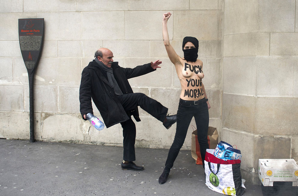
In another, which featured originally as an advert for the World Wildlife Foundation (WWF), a digitally created image shows a giant oil drum spilling its contents into a river through a vibrant, modern city; a beautiful representation of industrial pollution. In yet another, a topless Muslim woman demonstrating on a public street, being kicked by a passing man, ironically reveals the purpose of the anti-patriarchal violence slogan on her breasts.
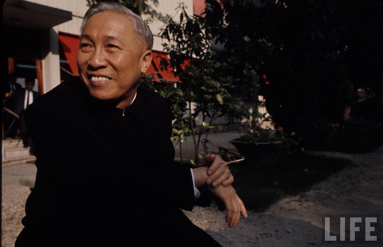
My favourite (probably because of my connection to Viet Nam) is an image of Le Duc Tho, the chief negotiator between the US and Viet Nam in 1973, relaxing, smiling, a humane foil for the millions of inhumane ‘enemy images’ that reduced ‘the Viet Namese’ to ‘savages’ and ‘gooks’ or ‘dinks’. For students who have only ever been presented with Viet Nam as a war, such images allow recognition of the human in the alien ‘Other’, sometimes creating empathy and connection with those who have been discursively dismissed from the category of humanity. A smiling, gentle face on a savage enemy challenges conventions and forces critical thinking.
There are some other images that display the capacity for translating the literal to the figurative in the ReView item. I realized I wanted abstract images and came upon DeviantArt. I use a variety of images from there, and copyright has been provided by the artist in question, for limited use in lectures, on writing to them.
The technical side is easier. I use Google Advanced Image Search, which allows me to set parameters like copyright, picture orientation, picture size (in terms of resolution and therefore quality), colour vs. black & white, and so on. I always use ‘larger than 800 x 600’. I’ve found it useful to do two things once I’ve found the slide (apart from carefully noting the copyright provision). First, I change the slide layout to ‘blank’, to remove unwanted placeholders (since I’ll be custom crafting text and text animation). Second, rather than using the ‘insert’ facility to drop in an image, I embed it in the slide. The reason I do this is because I apply text over the top of the image, and I want to avoid clicking on the image and accidentally moving it when I’m trying to work on a text box. So, I change the layout to BLANK, then RIGHT CLICK on the slide, FORMAT BACKGROUND, PICTURE FILL and then upload your image. The image is then fixed solidly in the slide.
I’m lucky to have spare time to do this; I am finding it is releasing a creative side to me I didn’t know existed and I am enjoying myself. Sure, I’m playing; but the student feedback to date has been extremely encouraging, and I have had the highest number of ‘Firsts’ in my Final Year Option in 20 years. My teaching has never been so well remarked upon, and I want to better understand why, and to develop this further. I’m only just starting to learn this myself, and I’m having a lot of fun and getting pedagogic results too.
I better discuss copyright at this point. There’s a very helpful guide here. It can be complex. And sometimes I can’t find the source of an image and its copyright. Some images are plastered all over the web without any indication of their origin. I can’t use them unless I can trace them, and most of the time I can.
But the safest – and least pedagogically effective in my experience – way is to set the filters in Google’s Advanced Image Search to a Creative Commons license or similar. This means you get the freebies. There are some amazing images out there we can use for free. But the best images are rarely gratis. That’s why I don’t use the filter. I find the best image and then I find a way I can legally use it. Sometimes, I buy the license myself. Often, that’s only a few pounds, and license is then taken care of. The University has image banks but again, they are rarely as good as the best stuff out there. On other occasions, I have identified the creator of the image and emailed them to ask if I can use their image for a lecture, once a year, where the image appears for maybe a few minutes, and is restricted to internal circulation (off-web). Each request I have made has been granted; the artists are often curious to know what the purpose is and we wind up learning from each other – them about what I do, and me about how they did it. I’ve been grated copyright by major news outlets, by radical digital artists and by individual painters. But if I can’t get copyright one way or another, I can’t use it. That’s sometimes a great shame; but there’s nearly always something else that will do the job nearly as well. I find it really stimulating, seeking the images out, heading down one alley only to find a dead-end – that leads me to my perfect image.


