Biting the Bullet: ending Death by PowerPoint, part 3: text
Text
I’ve made images the heart of my slides and the L&T experience. Now I turn to the use of text.
I have two things going on. One is text applied over images, the other is a different use of text on its own. For both I apply animation. I’ll deal with the technical aspect of animation in another blog. So, first to text over images.
Text should complement, rather than overwhelm, a slide and its embedded visualization, and in service of this, text should be minimalist. There is broad agreement across designers that less is more.
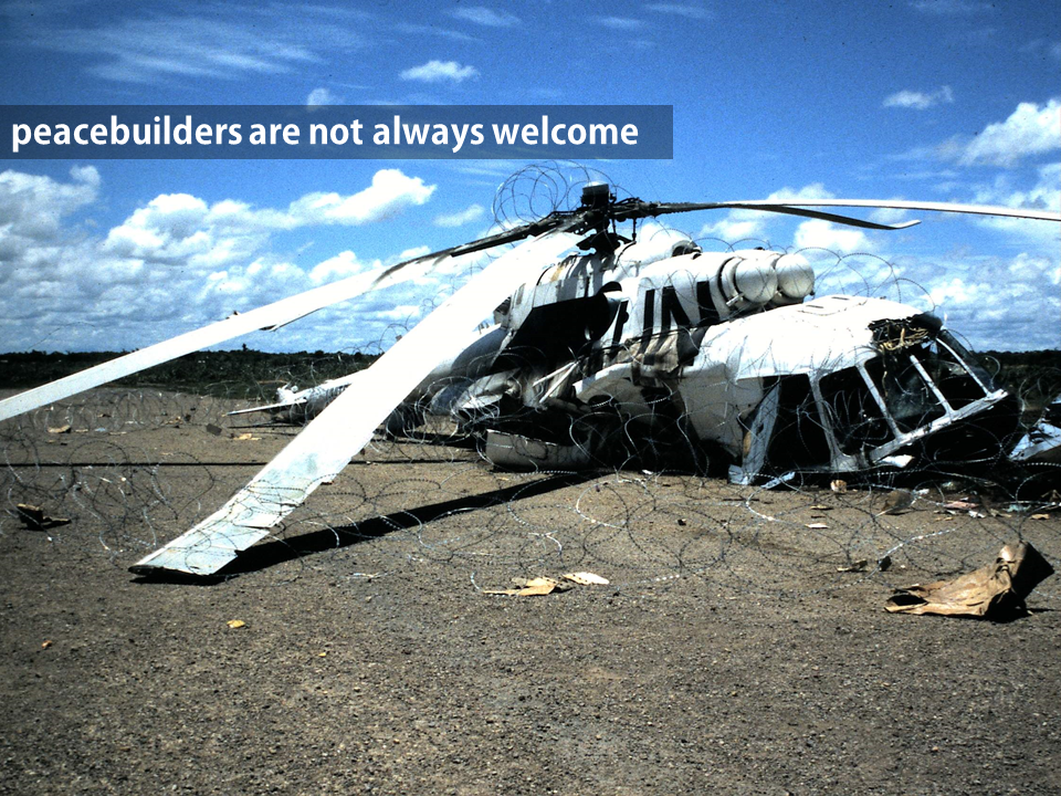 My own image, Siem Reap, Cambodia, May 1993.
Guides like Presentation Zen – an industry standard by an acknowledged ‘guru’ – recommend no more than 5-7 words per slide. I find it works well for me. The arch enemy of good presentations is the slide flooded with words and bullet points. I personally took to the Zen minimalist notion immediately, and with a sense of relief. I had become so fed up with presentations that swamped me so much that I turned off, and away, from them. I doubt I’m alone and I know students often feel the same way.

Inside S-21’s torture centre, Phnom Penh, 1991
I follow the minimalist rule for 5 reasons:
- MML literature broadly, and Cognitive Load Theory (CLT) specifically, make clear that the brain’s capacity is being misused by replicating in images what’s being said in words, either in text or from the lecturer.
- If what I am telling the students is already on the screen, one of us is redundant
- Images can do the talking: I don’t want to shoot myself in the foot by hiding an effective, powerful visual message with a duplicated text or vocal message
- Instead, the dual processing of the brain means we can transmit simultaneously on two different channels to students: images and words, differentiated but mutually reinforcing and synergising.
- I should be able to talk at length from just a handful of prompting words. I don’t believe I should be reading to students, either from books, slides or notes. We should all be better than that. Students are paying a lot of money for this experience.
This doesn’t mean everything’s done from memory. It means the words I use are distributed differently. You may wind up with 70 slides for a 2 hour session – most of which have 5 words or fewer on them. You may end of with 10 slides with images, and 50 words in total. It’s up to you how you do it. I have found that what I want to say in a lecture doesn’t change with the number of slides I use. I am saying the same as I ever said; I am just using fewer words on more slides. It doesn’t take me any longer to do the lectures I normally do: they’re just organized and presented differently and with different emphases.
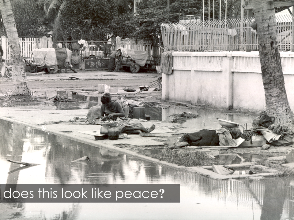 The aftermath of war: the main street in Phnom Penh, saturated with malarial water
In all these images, I have used fonts that are strong and sharp – sans serif for clarity. I filled the text boxes with transparency I can adjust to maximize text clarity, without comprising the appearance of the image.
Text alone
Many of my slides use text only.

I was quite unimaginative until I had a close look at some designers’ work on Slideshare.net.
 I started to get the idea of layouts and fonts from there, and from Presentation Zen (which I assure you I am not an agent for).

The text is animated when shown in PowerPoint; you can see how that can look in the Echo360 centre. I’ve included a few more examples here as well.

Then I got into showing numbers and using size and position to make statistics more engaging. Even the experts are still working on presenting stats, and I haven’t seen how they deal with hard sciences like Physics. A really valuable lesson I learned was that, even when you’ve got a valid amount of appropriate, complementary text serving those dual channels that MML theory talks about, it has to be presented so it can be seen against the image, without obscuring it.
This is really simple. Once you’ve dropped in your text (INSERT/TEXT BOX), right click FORMAT SHAPE/SOLID FILL/TRANSPARENCY. Adjust the latter so you can see the text without blocking the image. You can choose colours, but generally it seems best to use high contrast (black box, white text). I favour the simple, basic colour combinations. I also keep colours and fonts consistent (a common lesson in all the key design books I’ve seen) and I never use more than two different fonts in a given presentation. And now that I have them concise and clear, I can use a very simple tool to make them attract students’ attention.